5.1.4 Histograms
In this topic we will learn how to:
- draw and interpret histograms
A histogram is used to represent grouped continuous data. However, it does not show all the data points. It consists of bars of different widths joined together. There are no gaps between the bars. This is the difference between a bar chart and a histogram. Data for a histogram is usually displayed in the form of a class (a range of values), with its respective frequency.
We can use that information to help us calculate the information we need to draw a histogram:
- class width
- frequency density
\textcolor{gray}{\large\textbf{Variation and Measures of Central}\\ \textbf{ Tendencies for a Histogram}}\textbf{\textcolor{gray}{Mode}}The modal class is the class with the highest frequency i.e the highest bar on the histogram.\textbf{\textcolor{gray}{Median}}To calculate the median, we use the formula,
q_{2} = \frac{1}{2}nThe formula above, gives us the position of the median, which is denoted by q_{2} and n represents the sample size. We can use that number to find the class which contains the median.
Note: Since the data is continuous we cannot find the exact value of the median, but we can find the median class.
\textbf{\textcolor{gray}{Lower quartile}}To calculate the lower quartile, we use the formula,
q_{1} = \frac{1}{4}nWhere q_{1} represents the lower quartile. This gives us the position of the lower quartile. Again since the data is continuous, we can only find the class with the lower quartile. However, we can use that class to find the maximum and minimum values of the lower quartile, denoted by the upper and lower bounds, respectively.
\textbf{\textcolor{gray}{Upper quartile}}To calculate the upper quartile, we use the formula,
q_{3} = \frac{3}{4}nWhere q_{3} represents the upper quartile. This gives us the position of the upper quartile. Again since the data is continuous, we can only find the class with the upper quartile. However, we can use that class to find the maximum and minimum values of the lower quartile, denoted by the upper and lower bounds, respectively.
\textbf{\textcolor{gray}{Interquartile Range}}To calculate the interquartile range, we use the formula,
IQR = q_{3} - q_{1}Where IQR represents the interquartile range, q_{3} represents the upper quartile, q_{1} represents the lower quartile.
\textbf{\textcolor{gray}{Mean}}To calculate the mean when data is displayed in the form of a histogram, we need to first find the mid interval. This is the middle value for each class i.e the midpoint. We use the formula,
\overline{x} = \frac{\Sigma xf}{\Sigma f}Where \overline{x} represents mean, x represents the mid-interval, f represents the frequency.
\textbf{\textcolor{gray}{Variance}}To calculate the variance, we use the formula,
\sigma^{2} = \frac{\Sigma x^{2}f}{\Sigma f} - \overline{x}^{2}Where \sigma^{2} represents variance, x represents the mid interval, f represents the frequency, \overline{x} represents mean.
\textbf{\textcolor{gray}{Standard Deviation}}Standard deviation is the square root of variance. Therefore, the formula for standard deviation is,
\sigma = \sqrt{\frac{\Sigma x^{2}f}{\Sigma f} - \overline{x}^{2}}
Where \sigma represents standard deviation, x represents the mid interval, f represents the frequency, \overline{x} represents mean.
Let’s look at some past paper questions.
1. The times taken by 200 players to solve a computer puzzle are summarised in the following table. (9709/51/M/J/21 number 5)
Time (t seconds) | 0 ≤ t ≤ 10 | 10 ≤ t ≤ 20 | 20 ≤ t ≤ 40 | 40 ≤ t ≤ 60 | 60 ≤ t ≤ 100 |
Number of players | 16 | 54 | 78 | 32 | 20 |
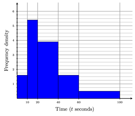
(a) Draw a histogram to represent this information.
To be able to draw a histogram, we need to first find the class width and the frequency density,
\textbf{class width = upper bound }-\textbf{ lower bound}\textbf{frequency density} = \frac{\textbf{frequency}}{\textbf{class width}}
Class Width | 10 | 10 | 20 | 20 | 40 |
Frequency Density | 1.6 | 5.4 | 3.9 | 1.6 | 0.5 |
Plot the classes on the x-axis, ensuring that each bar has the corresponding class width. Then plot the frequency density on the y-axis. Label the x-axis with the class name ‘Time (t seconds)’. Label the y-axis with ‘frequency density’.

(b) Calculate an estimate for the mean time taken by these 200 players.
Time (t seconds) | 0 ≤ t ≤ 10 | 10 ≤ t ≤ 20 | 20 ≤ t ≤ 40 | 40 ≤ t ≤ 60 | 60 ≤ t ≤ 100 |
Number of players | 16 | 54 | 78 | 32 | 20 |
To find the mean, we need to first find the mid intervals,
Mid Interval | 5 | 15 | 30 | 50 | 80 |
Frequency | 16 | 54 | 78 | 32 | 20 |
The formula for calculating mean is,
\overline{x} = \frac{\Sigma xf}{\Sigma f}Substitute into the formula,
\overline{x} = \frac{5(16) + 15(54) + 30(78) + 50(32) + 80(20)}{200}\overline{x} = \frac{6\ 430}{200}\overline{x} = 32.15Therefore, the final answer is,
\overline{x} = 32.15(c) Find the greatest possible value of the interquartile range of these times.
Time (t seconds) | 0 ≤ t ≤ 10 | 10 ≤ t ≤ 20 | 20 ≤ t ≤ 40 | 40 ≤ t ≤60 | 60 ≤ t ≤ 100 |
Number of players | 16 | 54 | 78 | 32 | 20 |
The formula for interquartile range is,
IQR = q_{3} - q_{1}To find the greatest possible value of the interquartile range, we need to find the maximum value of the upper quartile and the minimum value of the lower quartile,
q_{3} = \frac{3}{4}nq_{3} = \frac{3}{4}(200)q_{3} = 150When we add up the frequencies, we notice that 150 lies in the class,
40 \le t < 60Therefore, the maximum value in that class is 60, so the maximum value of the upper quartile,
q_{3} = \textcolor{#2192ff}{60}Let’s find the minimum value of the lower quartile,
q_{1} = \frac{1}{4}nq_{1} = \frac{1}{4}(200)q_{1} = 50When we add up the frequencies, we notice that 50 lies in the class,
10 \le t < 20Therefore, the minimum value in that class is 10, so the minimum value of the lower quartile,
q_{1} = \textcolor{#0f0}{10}Therefore, the greatest possible value of the interquartile range is,
IQR = 60 - 10IQR = 50Therefore, the final answer is,
IQR = 502. The numbers of chocolate bars sold per day in a cinema over a period of 100 days are summarised in the following table. (9709/51/M/J/20 number 7)
Number of chocolate bars sold | 1 – 10 | 11 – 15 | 16 – 30 | 31 – 50 | 51 – 60 |
Number of days | 18 | 24 | 30 | 20 | 8 |
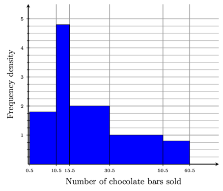
(a) Draw a histogram to represent this information.
You’ll notice that there are gaps between our classes. If we were to draw a histogram with these classes we would have gaps between our bars, and this would cease to be a histogram. To fix this we have to do continuity correction. For example, if the data is continuous, the number 10 represents any number that lies between 9.5 and 10.5.
To apply this to our classes, subtract 0.5 from the lower bounds and add 0.5 to the upper bounds, so that the classes represent the whole range of values,
Number of chocolate bars sold | 0.5 – 10.5 | 10.5 – 15.5 | 15.5 – 30.5 | 30.5 – 50.5 | 50.5 – 60.5 |
Number of days | 18 | 24 | 30 | 20 | 8 |
Now let’s use the classes after continuity correction to find the class width and frequency density,
\textbf{class width = upper bound }-\textbf{ lower bound}\textbf{frequency density} = \frac{\textbf{frequency}}{\textbf{class width}}
Class Width | 10 | 5 | 15 | 20 | 10 |
Frequency Density | 1.8 | 4.8 | 2.0 | 1.0 | 0.8 |
Plot the classes on the x-axis, ensuring that each bar has the corresponding class width. Then plot the frequency density on the y-axis. Label the x-axis with the class name ‘Number of chocolate bars sold’. Label the y-axis with ‘frequency density’.

(b) What is the greatest possible value of the interquartile data?
Number of chocolate bars sold | 1 – 10 | 11 – 15 | 16 – 30 | 31 – 50 | 51 – 60 |
Number of days | 18 | 24 | 30 | 20 | 8 |
The formula for interquartile range is,
IQR = q_{3} - q_{1}To find the greatest possible value of the interquartile range, we need to find the maximum value of the upper quartile and the minimum value of the lower quartile,
q_{3} = \frac{3}{4}nq_{3} = \frac{3}{4}(100)q_{3} = 75When we add up the frequencies, we notice that 75 lies in the class,
31 - 50Therefore, the maximum value in that class is 50, so the maximum value of the upper quartile,
q_{3} = \textcolor{#2192ff}{50}Let’s find the minimum value of the lower quartile,
q_{1} = \frac{1}{4}nq_{1} = \frac{1}{4}(100)q_{1} = 25When we add up the frequencies, we notice that 25 lies in the class,
11 - 15Therefore, the minimum value in that class is 11, so the minimum value of the lower quartile,
q_{1} = \textcolor{#0f0}{11}Therefore, the greatest possible value of the interquartile range is,
IQR = 50 - 11IQR = 39(c) Calculate estimates of the mean and standard deviation of the number of chocolate bars sold.
Number of chocolate bars sold | 1 – 10 | 11 – 15 | 16 – 30 | 31 – 50 | 51 – 60 |
Number of days | 18 | 24 | 30 | 20 | 8 |
To find the mean, we need to first find the mid interval,
Mid Interval | 5.5 | 13 | 23 | 40.5 | 55.5 |
Number of players | 18 | 24 | 30 | 20 | 8 |
The formula for calculating mean is,
\overline{x} = \frac{\Sigma xf}{\Sigma f}Substitute into the formula,
\overline{x} = \frac{5.5(18) + 13(24) + 23(30) + 40.5(20) + 55.5(8)}{100}\overline{x} = \frac{2\ 355}{100}\overline{x} = 23.55Therefore, the mean is,
\overline{x} = 23.55The formula for standard deviation is,
\sigma = \sqrt{\frac{\Sigma x^{2}f}{\Sigma f} - \overline{x}^{2}}
Let’s start by finding \frac{\Sigma x^{2}f}{\Sigma f},
\frac{\Sigma x^{2}f}{\Sigma f} = \frac{5.5^{2}(18) + 13^{2}(24) + 23^{2}(30) + 40.5^{2}(20) + 55.5^{2}(8)}{100}\frac{\Sigma x^{2}f}{\Sigma f} = \frac{77\ 917.5}{100}Let’s substitute into the formula,
\sigma = \sqrt{\frac{\Sigma x^{2}f}{\Sigma f} - \overline{x}^{2}}\sigma = \sqrt{\frac{77\ 917.5}{100} - (23.55)^{2}}\sigma = 14.98574322\sigma = 15.0Therefore, the final answer is,
\overline{x} = 23.55 \ \ \ \ \sigma = 15.0
